
Polish 3D
Polish +
NTU Overseas Education Expo: An online world map exhibition with a +4,000% participation rate?

In our collaboration, the design team demonstrated exceptional design skills and mature professional judgment. The overall structure of the website is sleek and minimal, with wisely used white space, clear and organized information, and a seamless user experience that ensures a smooth and comfortable browsing journey. The visual style is calm and simple yet rich in texture, achieving a good balance between functionality and aesthetics. The design isn't superficial; it shows dedication in the details, reflecting a high level of attention to the user experience. Overall, the design is not overly flashy, yet the attention to detail is apparent everywhere, making it a mature piece where professional skill and aesthetics coexist.
David / Project Manager / NTUOIA
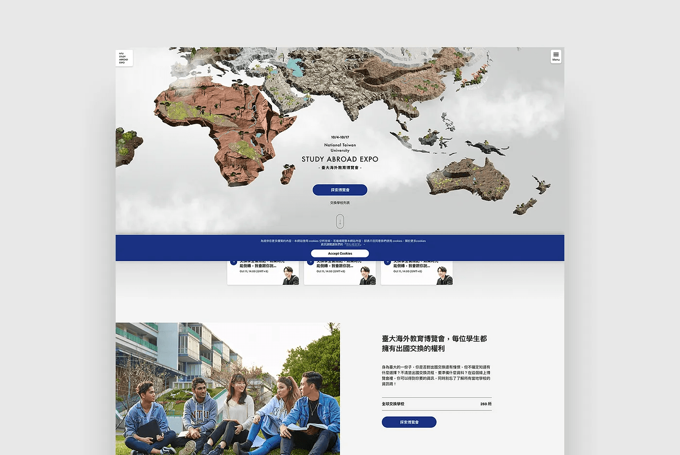
"At NTU, every student has the opportunity to participate in an exchange program abroad." This time, Polish™ has been commissioned by NTU's Office of International Affairs to transform the previously physical "Study Abroad Expo" into an online event. NTU partners with 260 exchange schools worldwide, and the information about these schools is extensive and complex. This expo is designed to convey this information more simply and clearly and to attract students to sign up for exchange programs, through an online platform.
Since its inception, from the data outcomes, the event can be considered quite successful. Last year's expo website had 100,000 views in a whole year, but this time we've surpassed 100,000 internal views in just 10 days. In the first seven days alone, 2,000 students logged in using their student emails (compared to around 60 in previous exhibitions), and live broadcasts have also broken historical records. Over 20% of logged-in students continuously browsed the site for more than 7 days, with the longest single session lasting 3 hours, and over 10% of students spent more than 2 hours online in a single session.
1. Integrating a 3D map with a one-page website enhances the browsing experience and curiosity, while clearly presenting textual information
NTU's partner exchange schools are spread across every continent. How can we let students immediately see that "there are many schools to choose from"? A typical one-page website struggles to display so many options at once, or it may appear unsightly. Therefore, we designed the website as a 3D world map—in one glance, all schools are visible without the need to elaborate "there are many schools"; the visual immediately communicates this to the students. The map format naturally stimulates curiosity and increases the immersive experience of "browsing the expo."
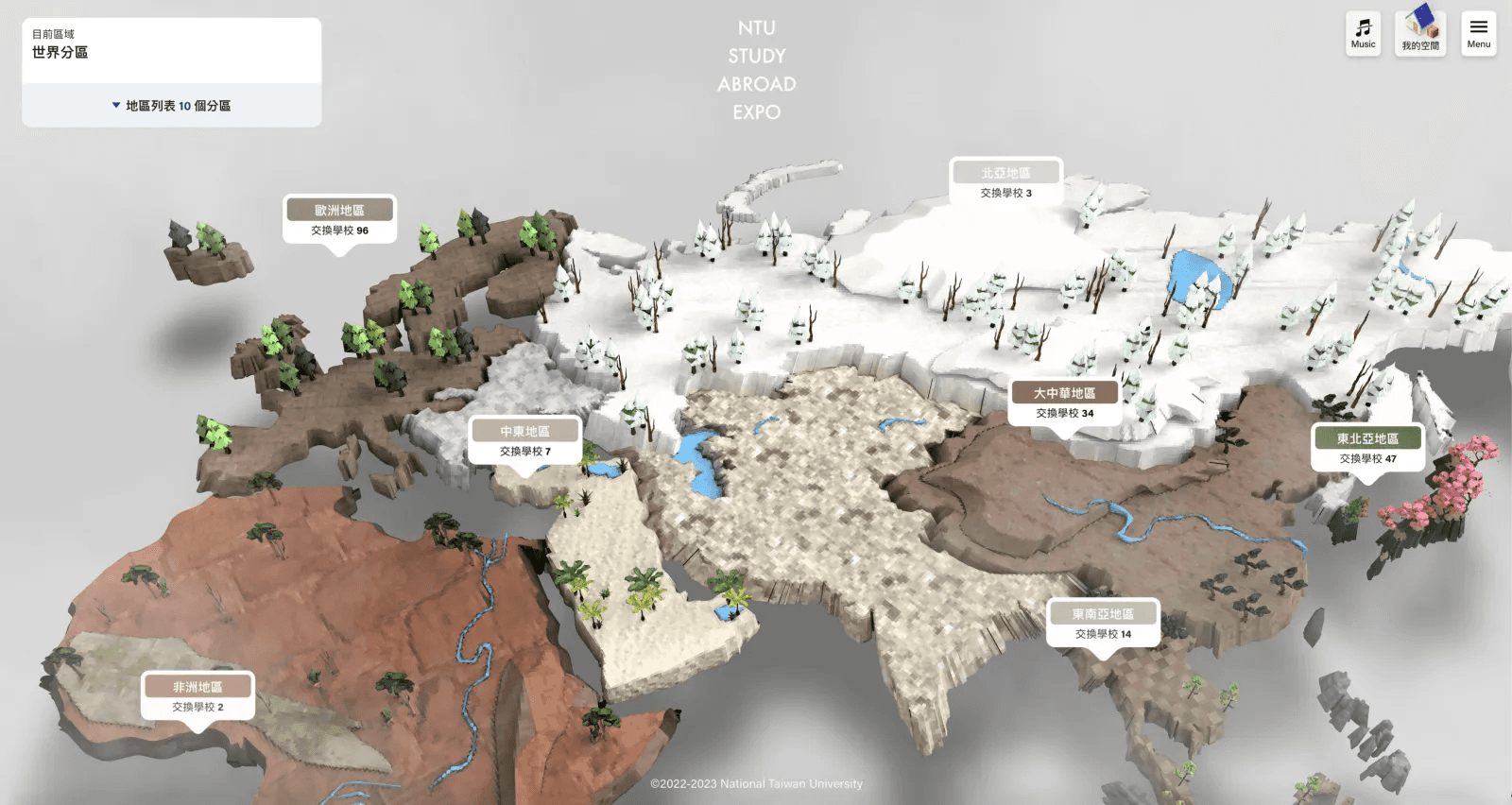
NTU Study Abroad Expo — World Map
Many online exhibitions have recently opted to use VR, which can provide an immersive experience but doesn't necessarily achieve the event's actual purpose. For users, completing an entire VR exhibition is challenging and it's easy to get lost, plus the content mainly consists of images and videos, which aren't suitable for presenting a lot of textual information. Our homepage uses a 3D map design to create an immersive atmosphere first, and for complex information presentation, we use a one-page website layout, making it easier for users to read.
2. Appropriate information sequencing and integration, showcasing key information step-by-step to prevent getting lost while browsing
The feature experience of the site is the "world map," but unlike most map experience sites that begin directly with the map, we've specially designed an "entry page" that not only allows more complete insertion of event information and more marketing space but also makes "entering the map" feel more ceremonial. In terms of information sequencing, we arranged the most important map at the top, followed by the core message of this expo aimed at breaking the preconceived notion among NTU students: "Everyone has the opportunity to exchange." Next, we listed the registration schedule to boost registration conversion rates, and lastly, shown the specially designed points-based game system of this expo.
Expo Homepage - One-Page Content
A major feature of this website is the "points-based game" segment. We offer prizes as incentives to attract students to log in and participate in the game. To maintain the overall tone of the website and balance with the points game, we grouped points, lottery-related pages, etc., in a Modal (pop-up window) rather than directly on the map page. This distinction allows exclusive student activities and other content to stand out, without creating a significant disparity for non-student visitors. The Modal includes not only selection information but also a fun "school quiz" to help students understand school information better. School information is available through map exploration and a "list format," with Filters (filters) to quickly find target schools.

South America Region — University of São Paulo (Modal)
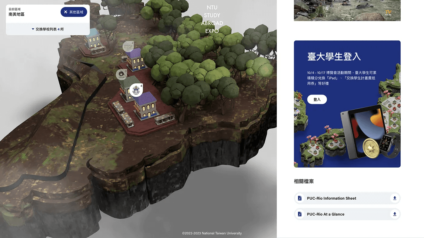
NTU Student Points Activity Login CTA
3. Using details to enhance aesthetics and offering tangible incentives to encourage students to willingly expand outreach
For an event website to achieve outreach, it needs to maintain a certain quality and offer sufficient incentives for boosting. This time, through points-based games, we encourage students to perform specified actions, with the highest-scoring students able to win grand prizes like an iPad or Apple Watch. We paired different website segments with various mini-games, including daily logins, exploring expo content, watching expo event live broadcasts, filling out surveys, etc. Completing different games earns points, and with a leaderboard mechanism, it stimulates students' competitive desires.
NTU Student Personal Space (modal) — Lottery Incentives + Invitation System + Leaderboard
Notably, a key focus of this points-based game is the referral system, encouraging students to invite others to log in, with more successful invites resulting in more rewards. While referral systems are common in games or app services, their success relies on the quality of the work itself; it must meet a certain standard for people to recommend it. We've put substantial effort into the website experience and design aesthetics this time, including specially crafted background music. It guides users from a global perspective to various locations with soaring sound effects, and from the melodies of piano and strings, subtle campus hustle and bustle can be heard, filling the exploration process with lively energy. The art aspect wasn't overlooked either; we designed school rooftops and structures according to the styles of different regions, arranging them in combinations that don't appear monotonous. These detailed touches create a positive perception, encouraging students to sincerely and generously share their experiences.
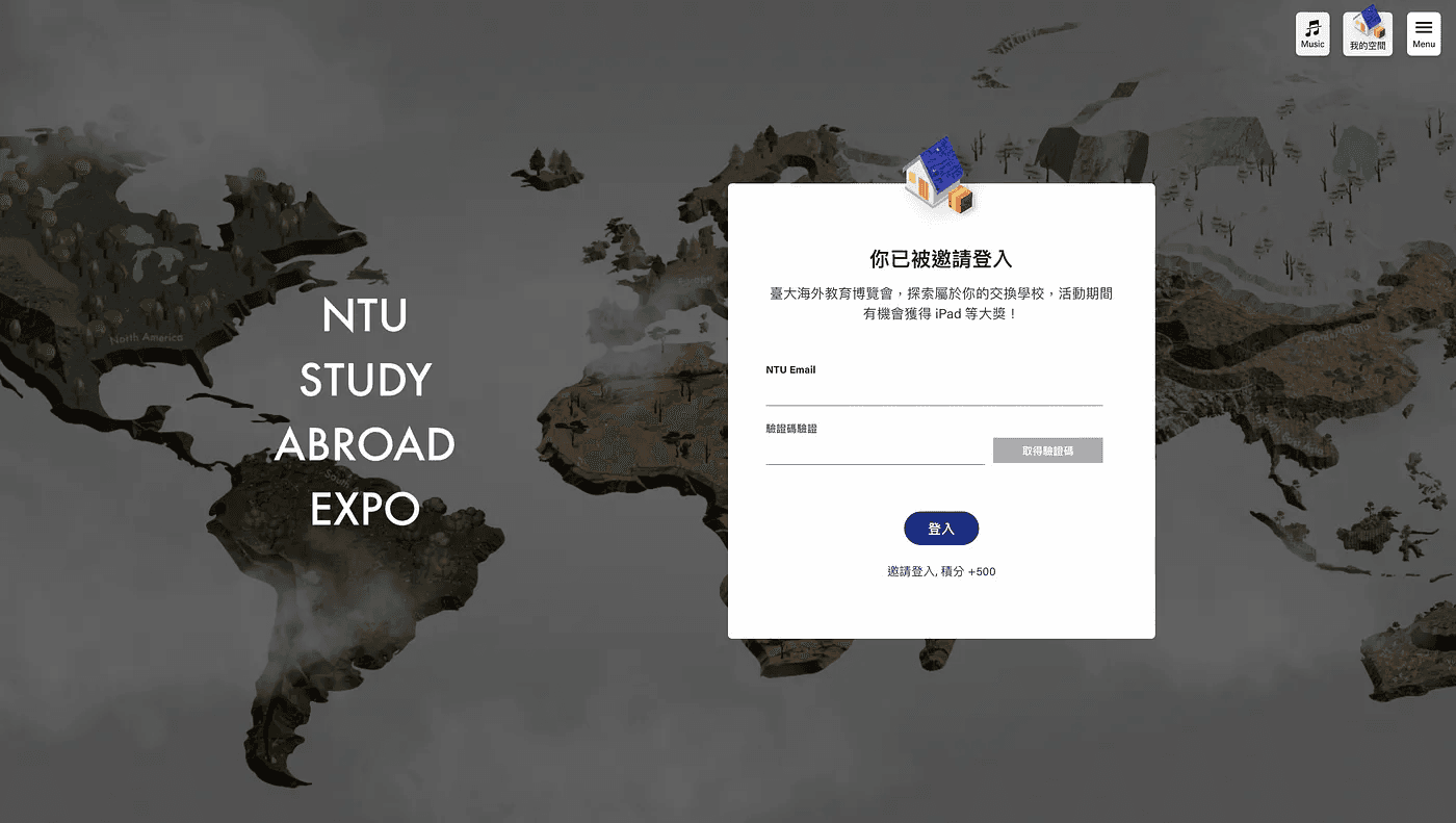
NTU Student Invitation Login Page
4. Utilizing Three.js to render 3D models, balancing visual effects and website performance
The front-end work by Polish™ took advantage of Three.js, allowing us to render 3D models in the browser. Although the built-in controllers are quite effective, for optimizing the interactive map experience, we eventually crafted our own, spending much time adjusting 3D parameters, including scroll speed, map size, boundaries, damping, etc. As modern users have increasing ways to access web pages, we had to understand the corresponding triggering events for different devices when creating custom controllers and make relevant calculations so that scene models and cameras move as expected.
World Map Experience Testing — Desktop Version
Of course, initially stepping into the realm of Three.js, it was challenging to understand which event listeners to use and how to calculate data from those events. Here, we must truly thank Bruno Simon's Three.js journey and the community he established, which allowed us to proceed step by step, eventually achieving the desired outcome.
One of the major hurdles in 3D work is balancing visual effects and website performance. Placing actual lighting and shadow effects can seriously drain performance, so we chose not to use direct lighting on the site but rather a baking approach. The shadows under the map tiles aren't in 3D, but processed using JPEG files, and we've compressed the image sizes to the greatest extent possible. Though we couldn't achieve extreme detail, we finally created a visual akin to Minecraft's pixel feel, offering a distinctive style without sacrificing the essential website experience.
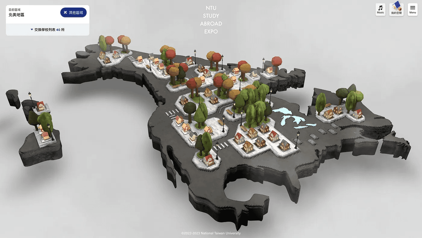
North America Region

Europe Region

Northeast Asia Region
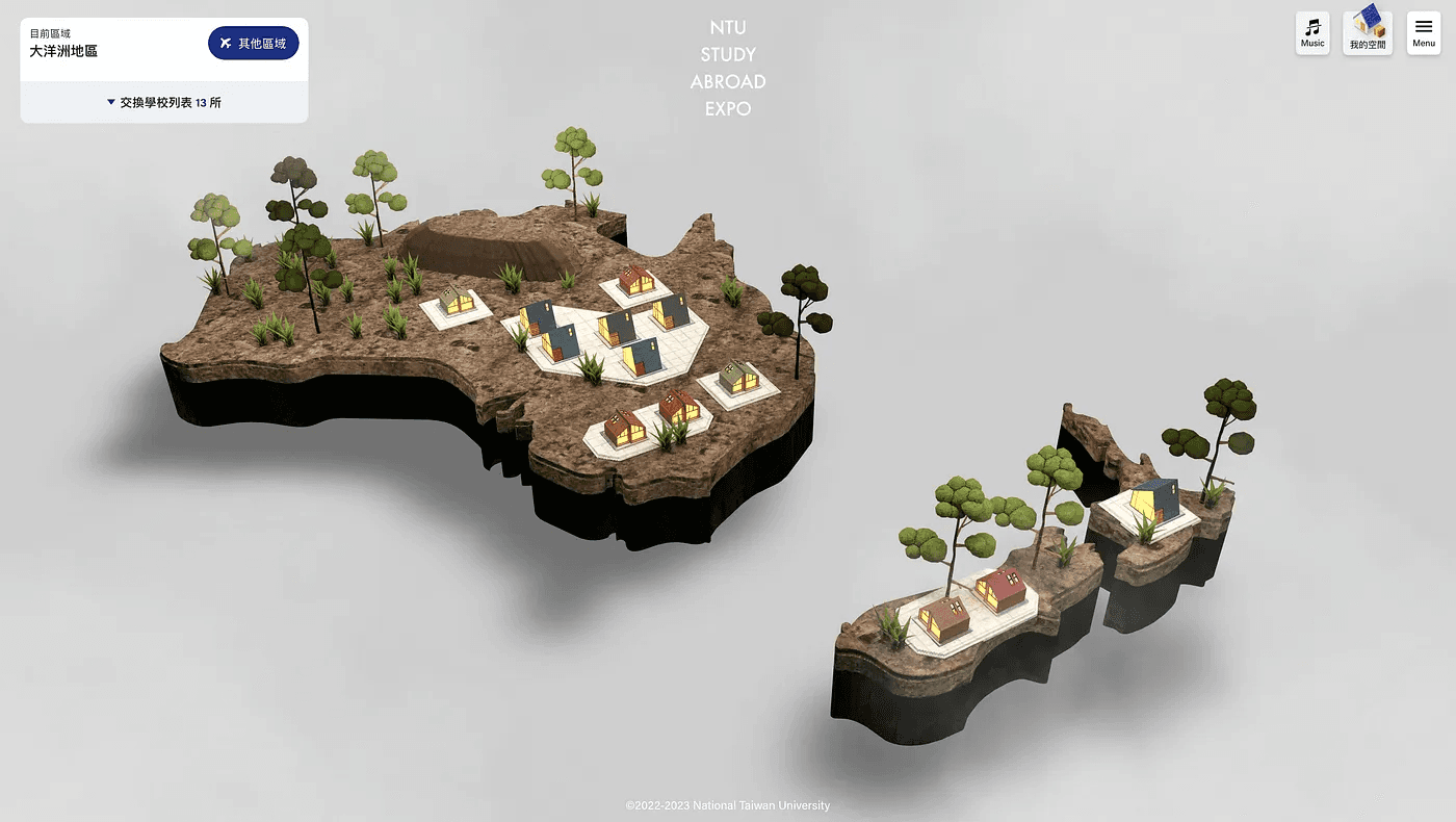
Oceania Region
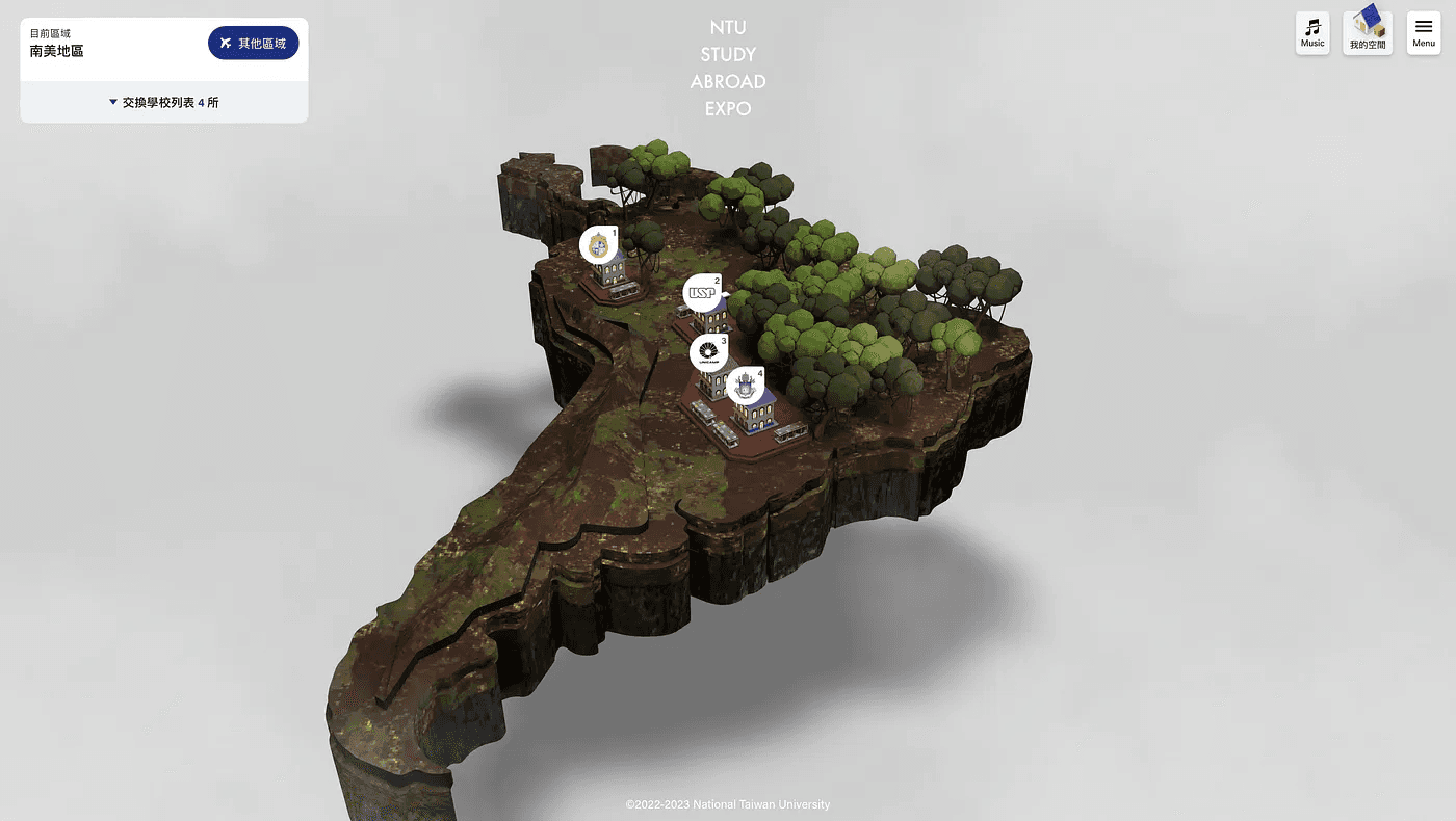
South America Region
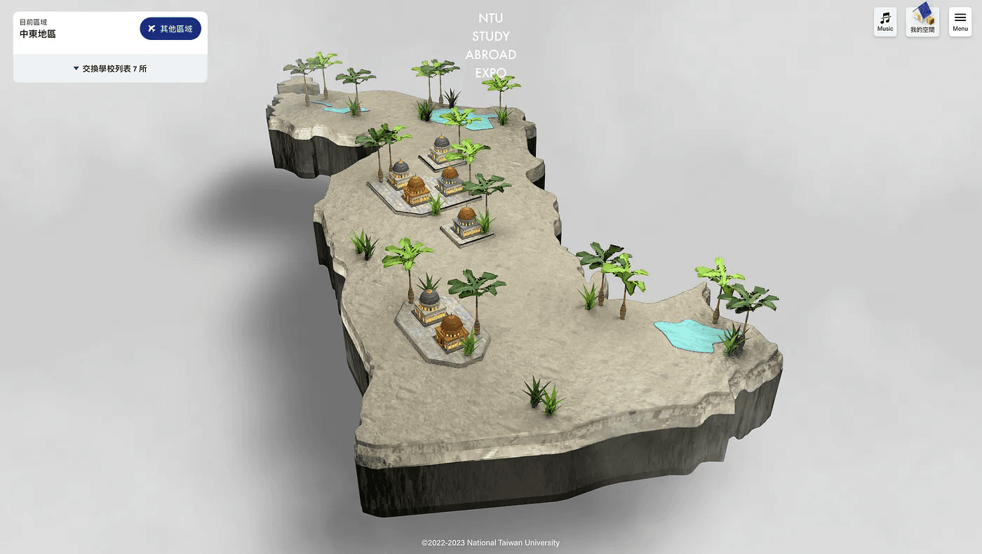
Middle East Region
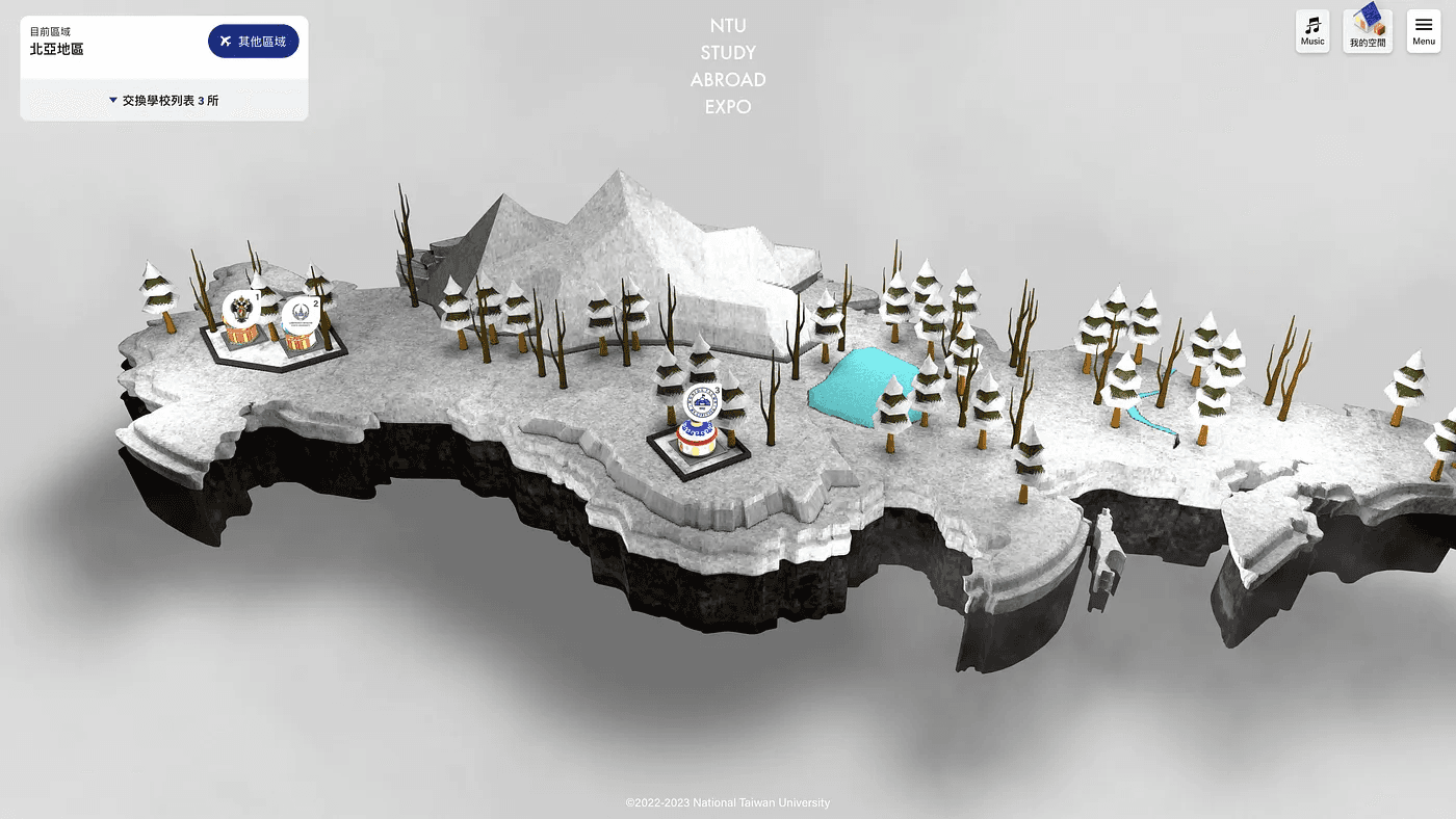
Northern Asia Region
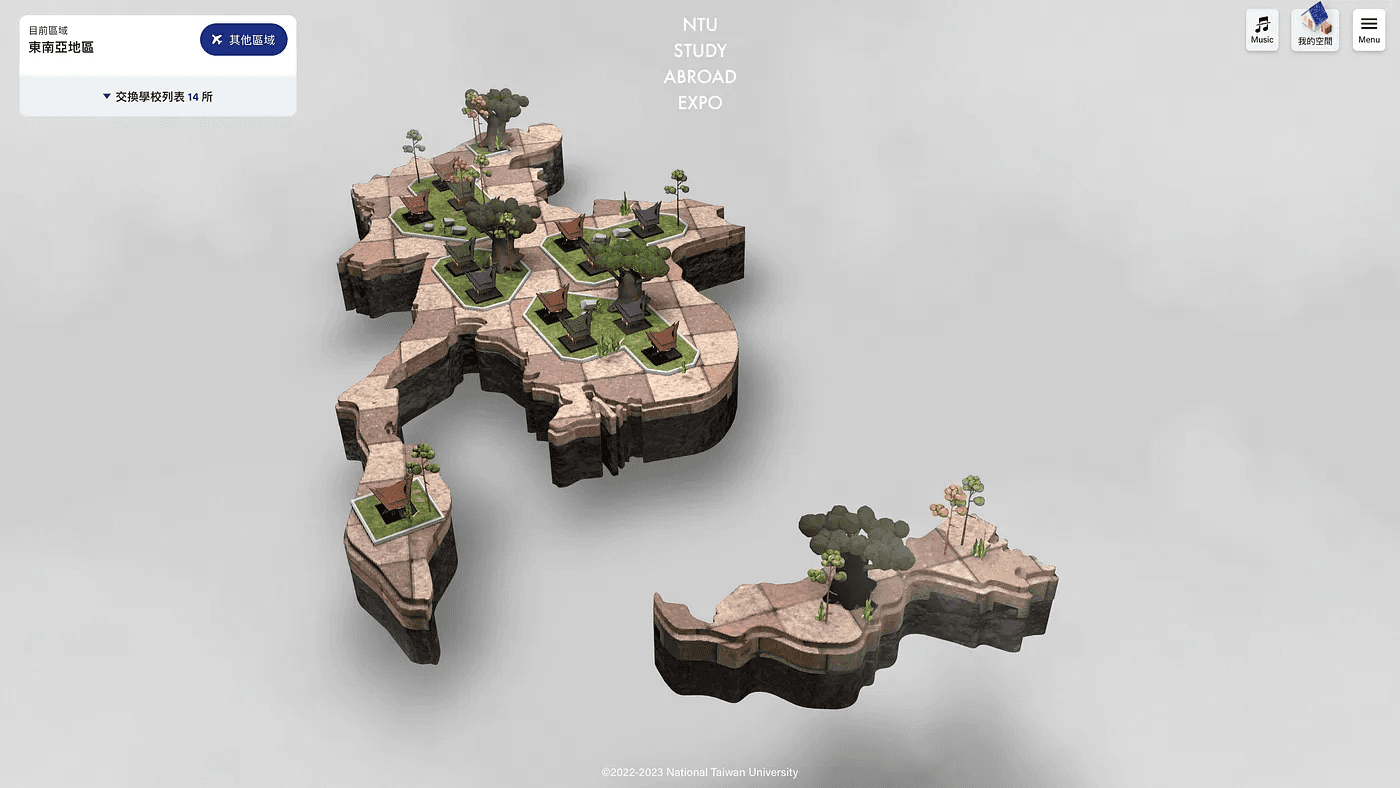
Southeast Asia Region
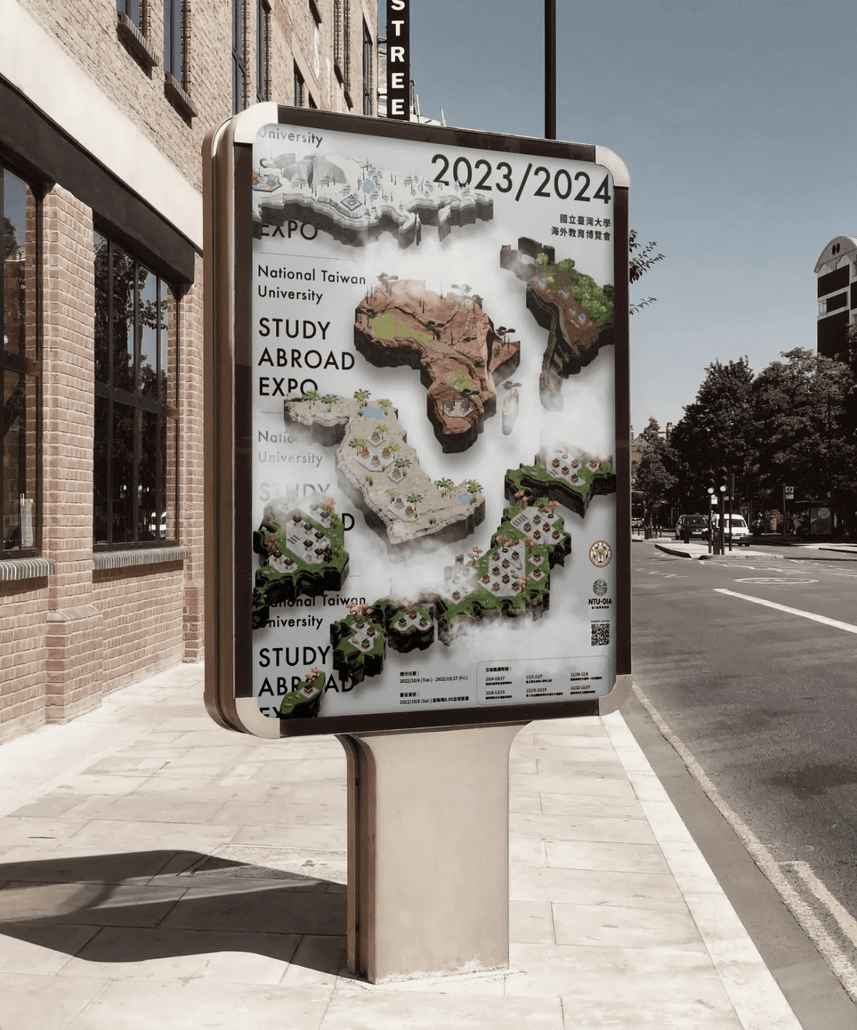
Expo Main Visual
Website link: https://studyabroadexpo.ntu.edu.tw/?openExternalBrowser=1


Start your 3D digital transformation here, and let Polish solve your design and technical challenges.
Fill out the form for a complimentary 1-on-1 consultation, and let's craft a unique product and brand experience just for you!