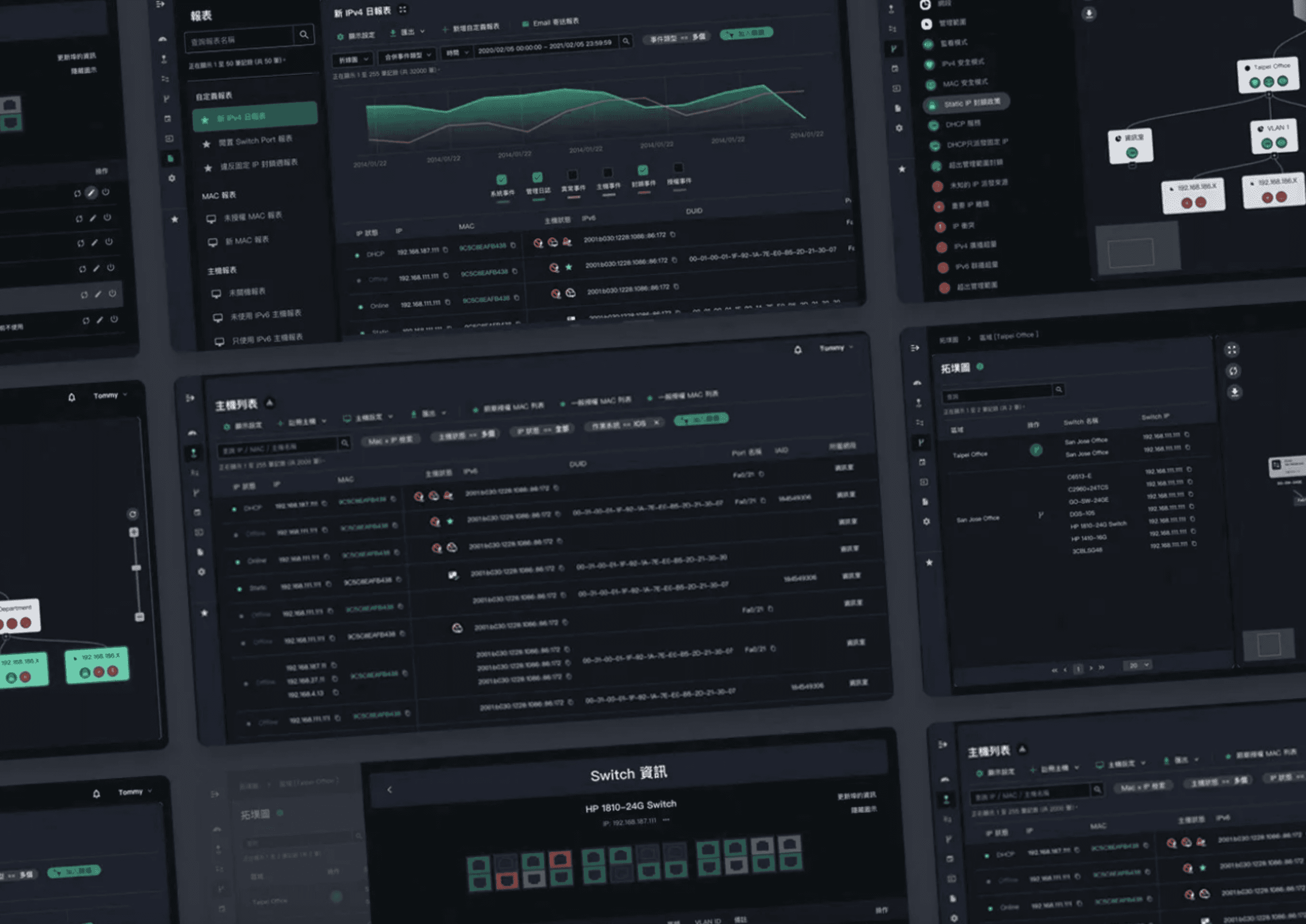
Great Interfaces for High Efficiency: Optimized UI/UX for PIXIS Network Management Platform Backend
POLISH™ was commissioned by the professional network management platform PIXIS to assist in the UI/UX optimization of the backend interface. The project execution was quite interesting and challenging, and after the conclusion, everyone on our team grew significantly—it was a project that combined both challenges and fun.
1. User's Main Complaint: Often Can't Find Features
PIXIS is a professional network management platform in Taiwan, serving as the official websites for several well-known corporate groups, monitoring traffic and cybersecurity status.
As the company's business grows, the functions within the platform have increased alongside the number of clients. However, the previous interface planning no longer meets current needs, resulting in newly added features being constantly attached to a dropdown sidebar. This means engineers often have to spend a lot of time scrolling down the menu to find the desired features.
Finding a feature is fine, but sometimes users have no idea under which option the desired feature falls, leading to being "lost" within the platform. This is a nightmare for engineers who need to swiftly resolve emergencies. Besides the aforementioned complaint, in customer interviews, we discovered that PIXIS's presales business, product managers, technical staff, front-end/back-end engineers all have different expectations and perceptions of the platform.
Therefore, we at POLISH™ conducted multiple interviews over approximately two months, documenting the difficulties they encountered during usage, categorizing, sorting, and establishing the project goals. (We almost turned into the clients' business ourselves haha) Meanwhile, the clients also allowed us to reference the "Platform Teaching Manual" usually given to partner companies, combined with detailed explanations of the business, to help us get into the situation.
2. Breaking the Conventional Process: From "Specification First, Then Design" to "Design First, Then Summarize"
PIXIS has a very high technical threshold, requiring consideration of various operational scenarios and RWD responsive design. Therefore, the optimization project for the platform interface took a lot of effort just to define the scope of cooperation, making us realize that the original design did not allow clients to fully understand.
In the past, we were accustomed to first defining design specifications, then applying them to all pages. However, this project revealed the gap between theory and practice, as the project’s requirements were complex, and the components were diverse. Therefore, "defining specifications first, then designing" would encounter many obstacles and yield less-than-expected results.
But to go back and modify each page could potentially prevent the project from being completed on time. So we decided quickly to start anew.
We prioritized designing the most frequently used main pages, and once completed, we looked for common logic between these main pages. After organizing and summarizing, these design specifications were then applied to other auxiliary pages.
This experience made us deeply appreciate that every project is different, and clients' needs vary. Flexibly adjusting the design method is very important. Only by not sticking to conventions can we build a good user experience with clients.
3. Core of User Experience: A Good Interface Achieves High Efficiency
這裡有來自 YouTube 的內容
需要開啟「功能性 Cookie」才能載入,YouTube可能會因此在你的裝置上設定 Cookie。
這裡有來自 YouTube 的內容
需要開啟「功能性 Cookie」才能載入,YouTube可能會因此在你的裝置上設定 Cookie。
1. Web Architecture and Design: Presenting Multilevel Information with Horizontal Panels
The uniqueness of this project lies not only in the needs of the products and clients but also in the fact the scenarios and content are very diverse and complex, so it is not possible to establish design principles in one go.
Following interviews, we underwent planning, designing, revising, thinking about the general applicability of components, adjusting, testing, confirming, and over 10 iterations before finally completing a highly versatile combination of components.
The reason that PIXIS's old backend interface led users to get lost was because the original features were all encapsulated in a "vertical dropdown" function sidebar, meaning there was only one way to present buttons. But we grouped similar features and distinguished them with "blocks." Through these components combinations like Main and Secondary Sidebars, Dropdown Menus, Bookmarks, Tree Diagrams, Multi-Layered Modal Windows, plus "Left-to-Right" "Horizontal Panels," users no longer have to endlessly scroll down the menu to find features.
2. Website Style Design: Visualizing Complex Information
After solving the feature problem, we believe aesthetic can improve readability, so regarding style design, we also made the following efforts:
Color: The brand green of the network management platform PIXIS was used as the main theme throughout the interface, indicating "normal status," with red and yellow representing "abnormal status." The hierarchy of all colors is lower than the text, making the whole picture achieve the effect of "highlighting key points without being glaring."
Status Visualization: Topology maps, host, and traffic status forms, at our insistence, visualized complex information through graphics. Using monochrome gradients and graphic supports, different host statuses are quickly identifiable.
Redesigned Icons: Given the large number of platform lists, presenting through icons can shorten reading time. Thus, after organizing and summarizing, we divided website statuses into 20 types, ultimately designing nearly 200 icons for specific forms, allowing MIS personnel to swiftly resolve website obstacles in golden time.
4. Impressive Achievements at the Taiwan Cybersecurity Conference
At the beginning of the collaboration, the client hoped we could complete the entire project before the cybersecurity exhibition. After half a year of effort, we finally completed the project on time, allowing the PIXIS team to gain many cooperation opportunities at the cybersecurity exhibition, becoming a bright presence!
5. Complete Experience Optimization Results
這裡有來自 YouTube 的內容
需要開啟「功能性 Cookie」才能載入,YouTube可能會因此在你的裝置上設定 Cookie。
這裡有來自 YouTube 的內容
需要開啟「功能性 Cookie」才能載入,YouTube可能會因此在你的裝置上設定 Cookie。
這裡有來自 YouTube 的內容
需要開啟「功能性 Cookie」才能載入,YouTube可能會因此在你的裝置上設定 Cookie。
這裡有來自 YouTube 的內容
需要開啟「功能性 Cookie」才能載入,YouTube可能會因此在你的裝置上設定 Cookie。
這裡有來自 YouTube 的內容
需要開啟「功能性 Cookie」才能載入,YouTube可能會因此在你的裝置上設定 Cookie。